In the dynamic world of web development, crafting responsive and visually appealing layouts is an art that demands the right tools. Two such tools, CSS Grid and Flexbox, have emerged as revolutionary techniques, reshaping the way we design and structure web pages. In this comprehensive blog post, we will delve into the strengths and intricacies of both CSS Grid and Flexbox, exploring how they complement each other and empower developers to create flexible, grid-based layouts.
CSS Grid: The Grid Mastermind
Understanding the Basics
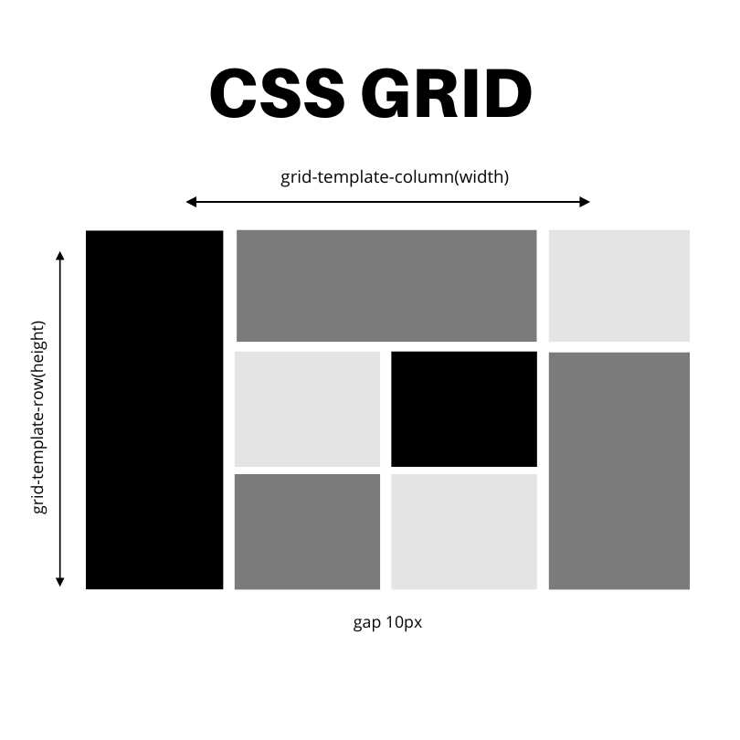
CSS Grid is a two-dimensional layout system that enables the creation of complex and highly customizable grid structures. It operates on both columns and rows, providing a powerful grid-based layout mechanism. To initialize a grid, declare the container as a grid using display: grid.
.container {
display: grid;
grid-template-columns: repeat(3, 1fr);
/* Define the grid columns */
grid-gap: 20px;
/* Add some space between the grid items */
}
Key Features
- Grid Template Areas: Define named grid areas within your container to lay out elements in a more readable and organized manner.
.container {
grid-template-areas:
“header header header”
“main main sidebar”
“footer footer footer”;
}
- Auto-placement: Let the browser automatically place items within the grid, simplifying your code and ensuring a responsive layout.
.container {
grid-auto-flow: dense;
}
Flexbox: The Flexibility Maestro
Grasping the Fundamentals
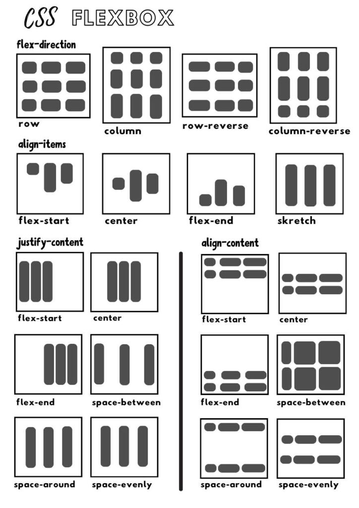
While CSS Grid excels in two-dimensional layouts, Flexbox is a one-dimensional layout system primarily designed for arranging items along a single axis. To initiate Flexbox, declare the container as a flex container using display: flex;
.container {
display: flex;
justify-content: space-between;
align-items: center;
}
Noteworthy Features
Flex Direction: Control the direction in which items flow within the flex container by setting the flex-direction property.
.container {
flex-direction: column; /* or row, row-reverse, column-reverse */
}
Flexibility: Allow items to grow or shrink based on available space, creating a flexible and responsive layout.
.item {
flex: 1; /* Grow and shrink equally */
}
Harmony in Diversity: Grid and Flexbox Together
The real magic happens when CSS Grid and Flexbox join forces. By strategically combining these layout models, developers can harness the strengths of both to achieve intricate and adaptive designs. For instance, use CSS Grid for overall page structure and Flexbox for fine-tuning the alignment of items within specific grid areas.
.container {
display: grid;
grid-template-columns: 1fr 2fr;
}
.sidebar {
display: flex;
flex-direction: column;
justify-content: space-between;
}
Conclusion: Unleashing Creativity with Grid and Flexbox
As we navigate the ever-evolving landscape of web development, mastering the art of layouts is pivotal. CSS Grid and Flexbox, each with its unique strengths, provide developers with unparalleled control over the structure and alignment of elements. Whether it’s the robust grid system of CSS Grid or the flexibility of Flexbox, these tools empower us to create visually stunning and responsive designs.
So, embrace the possibilities, experiment with combinations, and let the synergy of CSS Grid and Flexbox elevate your web development journey. The only limit is your creativity. Happy coding! 🚀✨


